My favorite part about taking photos is once i've finished editing, gotten everything tweaked, and I put the before and after side by side!
Today I'm going to go through a step-by-step process of a general edit I do in LRC, and I guarantee, if you try this, you will discover it makes a huge difference in your photos! These edits are specific to my style and what I like. If you are just getting started, there are tons of different styles and I encourage you to look some up to help you find yours.
In these edits I will not be using any particular preset, but rather playing with the colors, tones, and other elements on my own so you can see a more detailed view of what goes into the process.
I have attached all of my specific values in bold!
1. Cropping and straightening
The first thing I like to do in every image is crop and straighten it. There are a few rules you can use when doing this that I will cover more in another post but for today I decided I just wanted to crop a little excess from the background, but leave my entire body in the image. This photo didn't need much straightening, but i used the lines on the post I'm leaning against for my reference. I straightened first, cropped second, and then hit done.

Now you will find yourself back on the main editing screen.
2. Tone
Now this next step looks a little crazy at first, but I promise if you trust the process, you will not regret it. The next thing i do is I lower my contrast. ALL THE WAY down. Having a muted photo as your starting point helps to see any lines that may be concealed and want to reveal. And even though this looks completely off at first, once you use the curves adjustment, everything will fall back into place.

From here, after lowering the contrast I play with my Exposure. If you are shooting slightly underexposed, taking up the exposure will brighten and bring life to your photo. As you see here I only adjusted this slightly, taking it up to about +0.35.

As for the rest of the tones, I usually stick with close to the same thing. I take my Highlights-down (-35), Shadows-up (+12), Whites-up (+5), and Blacks-down (-17). (Exact values for this photo in parentheses)
3. Tone Curve
Now for the magic! Next I scroll down to my tone curve. If you are unsure what this is, it is the grid with a diagonal line going from the bottom left to the top right. The tone curve can seem intimidating, but is best separated into three parts. Starting with the bottom left, we are going to put a dot, this is going to represent your shadows. Next, we will place a dot in the dead center, this will represent your midtones. Lastly, we will put a dot in the top right, these are your highlights. So as you can see in the picture we have three dots. Now we are ready to get started.

From here you will click on the bottom left dot and drag it down slightly until you see your contrast coming back into the image to the degree you like it. After that you will hover over to the top right dot and drag this one up until you achieve the brightness you want back into your photo. Lastly you can play with your midtones. This will affect your skin, so depending on if you want your skin to be brighter or darker, you can drag this up or down. I usually take it up.

And just like that, VOILA! You have added contrast back into your image!
(Before/After)
4. Tonal Separation using Masking Tool
Now there is one main thing we are trying to do with this next step. That is create more separation between our subject and our background. We will do this in three key ways: 1-Exposure/Contrast, 2-Temperature/Hue, and 3-Saturation.
But first thing's first: We will start by scrolling all the way up and clicking our masking tool on the top-right of the develop column. If you are unsure; this looks like a dotted circle, next to the bandaid (healing) tool. After this I click "Select Subject" and wait for it to highlight my subject in red. Once your subject is highlighted we can begin to work on our three steps.
1-Take up your exposure and contrast, 2-Temperature should be taken up slightly, as well as tint. This is the Blue to Yellow dial and the Green to Magenta. The idea is you want your subject to have warm tones and your background to have cool tones. 3-Increase your Saturation. Then I play around with a few other minor tweaks, adding sharpness, clarity, lowering highlights, increasing shadows. Specific values in picture below.

(Temp: 5, Tint: 7, Exposure; 0.26, Contrast: 4, Highlight: -6, Shadows: 14, Whites: 5, Blacks: -5, Clarity: 9, Dehaze: 4, Saturation: 8, Sharpness: 46, Noise 19)

Next we are going to do the exact opposite on our background. So again, you will start by clicking the masking tool on the top right, and "Select Subject", but THIS TIME I want you to click and check the box right below the masking tool that says "Invert". This will select your background.
1-Take down your exposure and contrast, 2-Temperature should be taken down slightly, as well as tint. This is the Blue to Yellow dial and the Green to Magenta. The idea is you want your subject to have warm tones and your background to have cool tones. 3-Decrease your Saturation. Then I play around with a few other minor tweaks. Specific values in picture below.

(Temp: -8, Tint: -2, Exposure; -0.13, Contrast: -50, Highlight: -52, Shadows: 53, Blacks: -4, Texture: -6, Clarity: -6, Dehaze: 11, Saturation: -8)

After I added your Tonal Separation Adjustments:
5. HSL/Color
From here I play with my Luminance (darkness-lightness) and Saturation (amount of color) in my HSL adjustments section. This is located directly beneath the tone curve we worked with earlier.
A few key things I like to do, and are usually my personal preference: Orange affects the skin, so I take the luminance up slightly in the Orange to brighten the skin. Reds usually affect lips, and if there is not too much red in the picture, I take the luminance in the reds down to darken the lips. I also like to take the saturation in my yellows down and luminance for the yellows up, thus brightening the picture and taking away the yellow hues. I didn't feel the need to play with the hues in this photo, but sometimes i will change the hue of my greens and blues if it's necessary. Blues can reflect on clothes and blacks, so taking the saturation down and luminance up can give your clothing the true color you want without any strange hue. Specific values below.
(Saturation: Yellow: -52, Green: -15, Aqua: -32, Blue: -10, Purple: -19, Magenta: -16)
(Luminance: Red: -30, Orange: 37, Yellow: 40, Green: -40, Aqua: 55, Blue: 45, Purple: 31, Magenta: 46)
6. Back to Tone for enhancements
Lastly what I like to do is go back to the Tone tab for any last minute enhancements. Usually this includes exposure, contrast, clarity, and any temperature changes if I feel the photo is too cool or too warm. These adjustments are usually minor, but can have a large impact on the overall look of your photo.

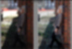
Final before and after of the finished image!